backgroundColor: This property is used to set the background color of the whole Scaffold widget.
backgroundColor: Colors.yellow, 6. primary: It is used to tell whether the Scaffold will be displayed at the top of the screen or not. Its default value is true that means the height of the appBar extended by the height of the screen’s status bar.
primary: true/false, 7. persistentFooterButton: It is a list of buttons that are displayed at the bottom of the Scaffold widget. These property items are always visible; even we have scroll the body of the Scaffold. It is always wrapped in a ButtonBar widget. They are rendered below the body but above the bottomNavigationBar.
persistentFooterButtons: <Widget>[
  RaisedButton(
    onPressed: () {},
    color: Colors.blue,
    child: Icon(
      Icons.add,
      color: Colors.white,
    ),
  ),
  RaisedButton(
    onPressed: () {},
    color: Colors.green,
    child: Icon(
      Icons.clear,
      color: Colors.white,
    ),
  ),
],
In the above code, we have used the RaisedButton that displays at the bottom of the Scaffold. We can also use the FlatButton instead of the RaisedButton.
8. bottomNavigationBar: This property is like a menu that displays a navigation bar at the bottom of the Scaffold. It can be seen in most of the mobile applications. This property allows the developer to add multiple icons or texts in the bar as items. It should be rendered below the body and persistentFooterButtons. See the below code:
bottomNavigationBar: BottomNavigationBar(
  currentIndex: 0,
  fixedColor: Colors.grey,
  items: [
    BottomNavigationBarItem(
      title: Text("Home"),
      icon: Icon(Icons.home),
    ),
    BottomNavigationBarItem(
      title: Text("Search"),
      icon: Icon(Icons.search),
    ),
    BottomNavigationBarItem(
      title: Text("User Profile"),
      icon: Icon(Icons.account_circle),
    ),
  ],
  onTap: (int itemIndex){
    setState(() {
      _currentIndex = itemIndex;
    });
  },
),
In the above code, we have used the BottomNavigationBar widget to display the menu bar. The fixedColor property is used for the color of the active icon. The BottomNavigationBarItems widget is used to add items in the bar containing text and icon as its child property. We had also used onTap(int itemIndex) function to perform an action when we tapped on the items, which works according to their index position.
9. endDrawer: It is similar to a drawer property, but they are displayed at the right side of the screen by default. It can be swiped right to left or left to right.
10. resizeToAvoidBottomInset: If it is true, the body and the Scaffold’s floating widgets should adjust their size themselves to avoid the onscreen keyboard. The bottom property defines the onscreen keyboard height.
11. floatingActionButtonLocation: By default, it is positioned at the bottom right corner of the screen. It is used to determine the position of the floatingActionButton. It contains many predefined constants, such as centerDocked, centerFloat, endDocked, endFloat, etc.
That’s all about the Scaffold’s various properties that give us an overview of the Scaffold widget. Its main purpose is to get familiar with different properties and their usage in Flutter application. If we want to learn it in more detail,
Let us see the example where we have tried to use most of the Scaffold properties to understand this widget quickly and easily.
In this example, we are going to see a Scaffold widget with an AppBar, BottomAppBar, FloatingActionButton, floatingActionButtonLocation, and drawer properties.
import 'package:flutter/material.dart';
void main() => runApp(MyApp());
/// This Widget is the main application widget.
class MyApp extends StatelessWidget {
@override
Widget build(BuildContext context) {
return MaterialApp(
home: MyStatefulWidget(),
);
}
}
class MyStatefulWidget extends StatefulWidget {
MyStatefulWidget({Key key}) : super(key: key);
@override
_MyStatefulWidgetState createState() => _MyStatefulWidgetState();
}
class _MyStatefulWidgetState extends State<MyStatefulWidget> {
int _count = 0;
Widget build(BuildContext context) {
return Scaffold(
appBar: AppBar(
title: Text('Flutter Scaffold Example'),
),
body: Center(
child: Text('We have pressed the button $_count times.'),
),
bottomNavigationBar: BottomAppBar(
shape: const CircularNotchedRectangle(),
child: Container(
height: 50.0,
),
),
floatingActionButton: FloatingActionButton(
onPressed: () => setState(() {
_count++;
}),
tooltip: 'Increment Counter',
child: Icon(Icons.add),
),
floatingActionButtonLocation: FloatingActionButtonLocation.endDocked,
drawer: Drawer(
elevation: 20.0,
child: Column(
children: <Widget>[
UserAccountsDrawerHeader(
accountName: Text("javatpoint"),
accountEmail: Text("javatpoint@gmail.com"),
currentAccountPicture: CircleAvatar(
backgroundColor: Colors.yellow,
child: Text("abc"),
),
),
ListTile(
title: new Text("Inbox"),
leading: new Icon(Icons.mail),
),
Divider( height: 0.1,),
ListTile(
title: new Text("Primary"),
leading: new Icon(Icons.inbox),
),
ListTile(
title: new Text("Social"),
leading: new Icon(Icons.people),
),
ListTile(
title: new Text("Promotions"),
leading: new Icon(Icons.local_offer),
)
],
),
),
);
}
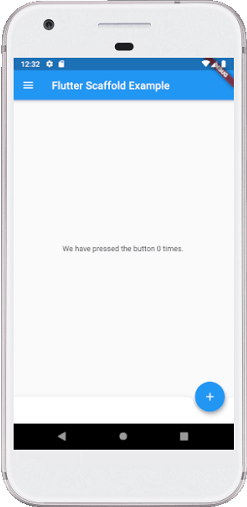
} Output:
When we run this project in the IDE, we will see the UI as the following screenshot.
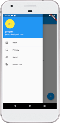
If we click on the three lines that can be seen in the top left corner of the screen, we will see the drawer. The drawer can be swiped right to left or left to right. See the below image.
Leave a Reply